An Oriental or Persian rug is not just something you lay on the floor; it also serves as a visual anchor, grounding furniture and putting the room in a certain mood that’s why rug colours need to be considered.
The colour of a rug is a strong influencer of a space’s feeling. Some colours may make a living room feel warmer and more welcoming, whereas others may convey a sense of calmness, openness, or concentration.
This is where colour psychology comes into play.
In interior design, colour psychology helps us understand how different tones and shades influence mood and behaviour.
Because rugs use a lot of space, the colour is more significant than many people may think.
I will take you through the process of selecting the right rug colour in each room, explain the psychology behind the various rug colours, and give you practical advice on making confident, long-lasting decisions when choosing the right rug for your home and lifestyle.
Colour Psychology and Rugs
When you think about choosing rug colour in your house, it is not only about matching the furniture but also about understanding how rug shades and hues influence mood, behaviour, and the overall tone of the space.
Colour psychology studies the effects of colours on human feelings and responses, which applies to rugs, whether they are on the wall or as a furniture accent.
How Colours Affect Mood and Behaviour
Colour isn’t merely decorative — it interacts with our brains and bodies.
They have been found to trigger measurable emotional and physiological responses.
Interior design studies also point to similar psychological correlations: warm colours usually promote energy and socialisation, cool colours usually promote rest, and neutral colours allow balance and visual rest.
Using Rug Colour to Influence How a Room Feels
Your choice of rug colour can subtly shape the emotional atmosphere of a space:
- Inviting and Energising: An attractive living room can be made more comfortable and lively with a warm-coloured rug in rich rust or burgundy, inviting guests.
- Calm and Serene: A soft blue or green rug can evoke a sense of calm; best placed in bedrooms, reading corners, or offices.
- Balanced and Versatile: Neutral rug shades can be used between furniture and wall colours to keep everything in harmony without overwhelming the room.
Because rugs frequently cover a large visual portion of the floor, their rug colour variations literally outsize influence – they are the emotional floor we walk on.
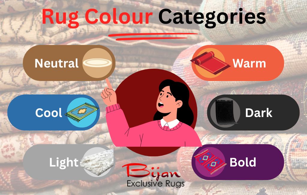
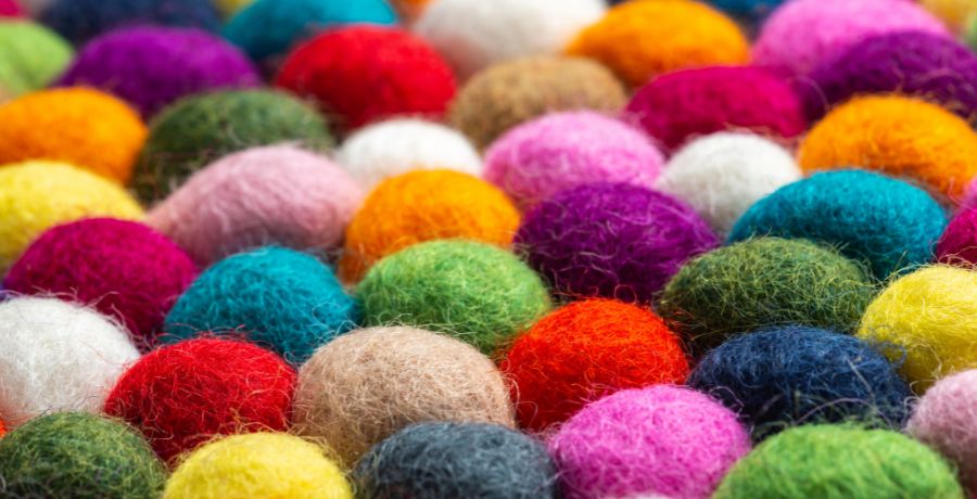
Exploring Rug Colour Categories and Their Effects
It is not only a matter of aesthetics, but also shaping the roomy feeling and functionality, which is why it is hard to pick the right rug colour.
Here’s a guide to key rug colour categories and their psychological effects.
Neutral Rug Colours
Examples: beige rugs, ivory rugs, cream rugs, grey rugs, taupe rugs
Neutral tones serve as a peaceful foundation in interior design.
They provide a feeling of stability and balance so that they can be used in nearly any rug style or type – from minimalist to layered interiors.
Neutrals are especially useful when your goal is a soothing backdrop that lets other elements stand out while keeping the space cohesive and serene.
Neutral rug colours can create a sense of calm and understated elegance, especially in the living room or bedroom, where relaxation is a priority.
Warm Rug Colours
Examples: red rugs, rust rugs, terracotta rugs, orange rugs, yellow rugs
Warm rug hues create an inviting and lively ambience.
In colour psychology, warm tones are associated with energy, enthusiasm, and sociability — traits that make them effective in spaces designed for gathering and interaction.
Warm colours are linked to energy, enthusiasm, and sociability, characteristics that are instrumental in gathering and socialising spaces in colour psychology.
Warm-coloured rugs can create dynamic, welcoming environments. The presence of reds and oranges fosters conversation and cosiness, while the use of yellows creates optimism and clarity.
Cool Rug Colours
Examples: blue rugs, green rugs, teal rugs, soft purple rugs
Cool tones typically recede visually and project a calm, soothing vibe.
Blues and greens, especially, are associated with calmness and equilibrium and are therefore the most appropriate colours for spaces where one is meant to rest or concentrate.
They can reduce stress and foster concentration, which is why they fit well in bedrooms, home offices, or even meditation spaces.
Dark Rug Colours
Examples: charcoal rugs, navy rugs, deep brown rugs, black rugs
Dark rug colour options provide depth and richness. Dark colours ground a room and may bring in an air of privacy and style.
Used strategically, these tones ground furniture and architectural elements.
Deep hues suggest stability and elegance, and they can make a big room feel cosier or more deliberately structured.
Unlike light walls and pieces of furniture, dark rugs are visual drama without being overwhelming.
Light Rug Colours
Examples: white rug, pale grey rug, soft pastels, pink rugs
Light rug shades visually enlarge a room by reflecting more light and giving the impression of openness.
These tones are great for visually enhancing a small or dark space.
Bold & Statement Rug Colours
Examples: jewel tones, bright hues, multicoloured patterns
Statement rug hues make a powerful design impact.
Bold shades like emerald green, sapphire blue, or vibrant plums draw attention and can act as visual anchors in an interior.
The use of bold colours is associated with confidence and creativity. When carefully applied, they can add personality to the space without feeling oppressive.
Matching vs. Contrasting Rug Colours
Choosing rug colours is also about how they interact with the rest of the room.
How you choose to match or contrast your rug with your walls and furniture determines harmony, visual interest, and atmosphere.
When to Match Rugs With Walls or Furniture
Matching rug colour with walls or furniture doesn’t mean an exact clone.
Designers advise coordinating tones and undertones rather than absolute matching, as absolute matching can result in a one-note effect in a space.
Matching intensity — how light or dark a colour is — and undertones (warm vs. cool) tends to produce harmony without monotony.
Rugs that echo the sound of the walls or furniture, but in a slightly different colour, can make the room cohesive without the matchy-matchy effect that would make it one-dimensional.
The method helps create a visual flow and makes the room appear intentional rather than accidental.
Creating Harmony Through Tonal Matching
A standard method of creating harmony is tonal schemes (colour variations of one colour) or monochromatic (colour varieties of one colour).
Designers tend to match walls, furniture, and rugs within similar colour families, with varying saturations, to create a rich yet cohesive appearance.
One of the rules of interior design, the 60-30-10 rule, proposes that 60 per cent of your palette can be predominantly on the walls, 30 per cent on furniture, and the remaining 10 per cent on accents, such as rugs, to create a balanced, harmonious space.
Using Contrast to Add Depth and Interest
Contrast is where rug colour options shine.
A rug that stands in contrast to walls or furniture brings depth, anchors spaces, and draws attention to key zones — especially in open-plan layouts.
Designers often recommend using contrast when your goal is to make a rug a focal point.
When making a rug with a centre point, designers advise using contrast.
Rug Colours That Hide Dirt and Wear Well
When selecting rug colours for busy homes, style is less important than practicality.
Some patterned and coloured rugs are known to hide dirt, wear, and general messiness – without any loss of style.
Rug colours in medium tones (greige, taupe, dark blues, and natural-toned browns) work well in high-traffic areas.
They do not go to extremes: very light rugs are stained easily, and very dark rugs highlight dust and pet hair.
The interior design guides always suggest mid-range colours that are durable and long-lasting.
Check our cleaning a Persian rug guide.
Rug Colours That Visually Expand Small Spaces
The right colour of the rug can make a small room appear significantly bigger, lighter, and more open.
Interior design research and colour psychology demonstrate that some rug colours can affect the perception of space, particularly in compact areas.
Light-coloured rugs like soft greys, creams, off-whites, and pale neutrals reflect more light, which makes the rooms look brighter and more spacious.
Light blues, greens, and light muted greys are cool colours that, by nature, are recessive to the eye and make it seem three-dimensional.
Studies on colour perception indicate that cooler colours make spaces feel larger and less confined.
Choosing the Right Rug Colour for Each Room
Different rooms are used in different ways, and the rug colour you choose should support how each space is used.
Living Room
Living rooms benefit from either warm rug colours (rust, terracotta, warm beige) that get people to sit down and talk, or neutral colours that provide balance and adaptability.
Bedroom
The research of colour psychology associates cool colours with low-saturation and reduced stress levels and improved calmness -best to have in the sleep rooms.
Dining Room
Rugs in the dining room must be comfortable and practical.
Medium-toned rug colours and subtle patterns can conceal spills while still being inviting.
Interior guides suggest avoiding very light rugs in dining rooms due to maintenance concerns.
Home Office
The colouring of workspaces is often recommended to be blues, greens, and soft neutrals.
Research indicates that these colours help enhance attention and brain sharpness without overstimulation.
Hallways and Entryways
Darker or patterned colour options, such as charcoal, earthy browns, or multi-tones, are preferred in high-traffic areas.
Such colours are used to conceal dirt and wear while setting up intermediary areas.
Practical Tips for Choosing Rug Colours
Choosing the right rug colour doesn’t end with your first instinct; it’s about the rug’s engagement with light, space, time, and texture.
These are practical strategies that can help ensure that your rug tones and colours not only look impressive but also work out beautifully in real life.
Test Rug Colours in Different Lighting
The rug’s colours are significantly altered by light. The beautiful colour that seems warm and rich in a store would be washed out or look totally different in your room.
- Artificial light (in particular warm bulbs) can make warm colours richer and cool tones sharper. Test the behaviour of the carpet samples at different times of day.
- Light-reflective floors, such as glossy wood or tiles, may increase brightness and alter the perceived colour of the rug. Directional lighting and shadows also influence the way tones are experienced during the day.
Tip: Bring physical swatches or samples into your room and observe them under your specific lighting throughout the day.
Paint physical swatches or samples in your room and note how they look under your particular lighting during the day.
Think Long-Term, Not Just Trends
Trending rug colours may be thrilling at the moment, but what was new a year ago may be considered dated a year later.
More neutral and balanced colour schemes tend to be safer in the long term, while ultra-bold or flashy hues can take over a room and age it quickly.
Ever-changing fashion trends may cause visual fatigue.
An appropriate traditional tone helps your room feel stable and comfortable over time, rather than being overly reactive to trends.
Tip: If you love bold colour, use it in accents (pillows, throws, art) and let your rug colour be the foundation that stays relevant year after year.
Balance Colour With Texture and Pattern
Colour doesn’t work alone — rug texture and patterns change the way colour is perceived and how comfortable a space feels.
- Texture adds depth
- Patterns tie colours together
- A neutral rug with subtle texture can be more appealing to the eye than a plain, solid colour.
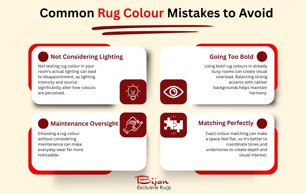
Common Rug Colour Mistakes to Avoid
Selecting a rug colour can be exhilarating. Yet, designers and colour psychology scholars note that certain pitfalls are likely to make even a beautiful rug feel out of place.
Here’s how to avoid the most frequent mistakes:
Choosing Colour Without Considering Lighting
Not testing the actual lighting in the room is one of the greatest mistakes people make when choosing the colour of their rugs.
The effect of light on rug colour dramatically influences their appearance. What seemed bright in the showroom can seem drab in the house.
It has been found that the intensity and the light source produce can change the colour interpretation by our brains.
Going Too Bold in Already Busy Rooms
Bold rug colour options and vibrant patterns can be gorgeous — in the right space.
However, putting a high-impact colour or a frantic graphic design into a room that is already very active (bold walls, patterned upholstery, eclectic decoration) can make the result feel chaotic rather than cohesive.
As per the rule of interior design, visual overload occurs when the variety of high-intensity colours and patterns clash, resulting in stress rather than harmony.
Simple colour theory helps designers balance loud accents with less-stressful backgrounds to reduce tension in the image.
Ignoring Maintenance Requirements
One of the most common mistakes is basing decisions on appearance without considering how easy or difficult they are to maintain.
Very light rugs may show dirt and stains more easily, while very dark rugs can show lint, pet hair, or dust more visibly — especially under certain types of lighting.
Research in design psychology has focused on the significance of functional aesthetics – how design not only serves for appearance, but also works in real life.
Matching Everything Too Perfectly
It’s tempting to attempt to perfectly match your rug to the colours of your walls, fabric or accessories – but the result can make the space flat, too designed, or generic.
Designers generally recommend harmony through matching tones and undertones, rather than exact colour matching.
Colour theory suggests using complementary or analogous colours (colours that are side by side on the colour wheel) rather than matching colours to make interiors dynamic.
Conclusion: Let Colour Lead the Way
Rug colour plays a key role in shaping mood, balance, and flow.
The trick lies in striking the proper balance between the psychology of colour, personal style and practicality in daily life.
A rug should not only look beautiful, but also suit your lifestyle, lighting, and long-term needs.
The combination of these factors creates a place that feels considered, united, and an actual pleasure to reside in.
At Bijan Exclusive Rugs, we understand that every home is different. That is why we offer a wide variety of colours, tones, and shades so you can find the right rug colour for your style and vision.
We can assist you in case you are not sure where to begin. Browse our collection to find the right colour of your rug to transform your room.
Explore the Bijan Exclusive Rugs collection, use our rug visualiser, and let colour lead the way. Contact us now!